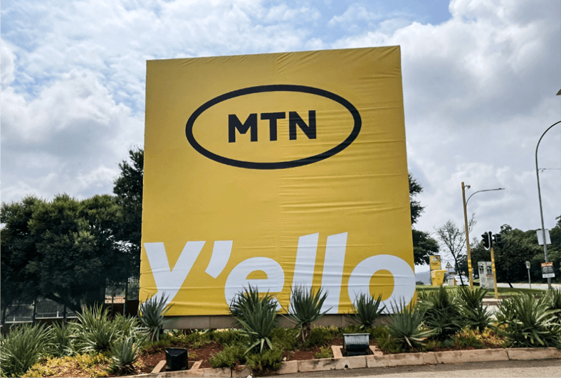
Transitioning from Telecommunications to Tech, from “Everywhere you go” to “Y’ello”
You can see that the need for a logo change didn’t just happen because someone was tired of the old one. It happened because a new trajectory is about to be launched.
Also, before you start to talk about whether it’s fine or not, may I tell you that the value of a logo is not in the aesthetics, but in the meaning it brings and they story it tells. And most often, the meaning (or story) does not have to be so obvious to the masses.
For instance, you probably wouldn’t know what Amazon’s logo means if they didn’t tell you by themselves. Same with FedEx and many others.
Now that we have established this foundation, let’s talk a bit about the current logo redesign trend among big multinational brands.
For a little over a decade, it’s been a journey from complex to simple. Think of Google, Microsoft, eBay, Facebook, Sterling Bank, just to mention a few. So, MTN going the minimalist way is not out of place.
Now, let’s talk about look and feel ![]()
Every successful logo design has a set of qualities: simplicity, relevance, versatility, timelessness, scalability and impact.
Now, while I personally would give them a pass for all the qualities, I want to keep my fingers crossed on the ‘Impact test’ until I begin to see how the logo is being applied across their marketing channels and how they can drive a narrative with it.
For now, I don’t have much to say.
A few things to check from the design aspect: The typeface (perhaps, the Montserrat family) works so well. The oval outline works very well. The colour choice works very well.
I can see they tried to still keep some characteristics of the old identity that shouldn’t be lost for the sake of easy recognition by their market.
And also, their telecommunications part is still alive. But in a bid to capture the new trajectory, they’ve got to lose some of the old details which may be misleading to the new audience.
Now, does it looks Tech or not? First let’s ask ourselves, does Apple logo look Tech, really?
Eventually, we will all get used to this, just as we have gotten so used to the Apple logo.
In another post, I’ll talk about where the major work of branding/rebranding is, and why many of these ridiculously simple logo redesigns we see cost a fortune.
Most often, these logo redesigns receive huge backlash from an uninformed crowd of people who think the whole thing begins and ends behind a computer screen.
I remain your BrandCore Strategist.


